


By: Emmalee Anglemyer & Ashley Bergeron
Layout Editor & Staff-Writer
Awe is sweeping across IU campuses as students realize that the IU trident is actually an I and a U superimposed over each other. I repeat, the IU trident is actually an I and U!!!
When asked how he felt about it, gnome business major Sceeblemorph stated how surprised he was when he first learned about it.
“I had to take a break from my Color The World in Green class’s homework,” Sceeblemorph stated. “My world was flipped upside down and I needed to process that.”
This begs the question: why has this been hidden for so long? Why is the logo continuously referred to as a trident in an attempt to obfuscate the TRUTH: it’s just two letters?
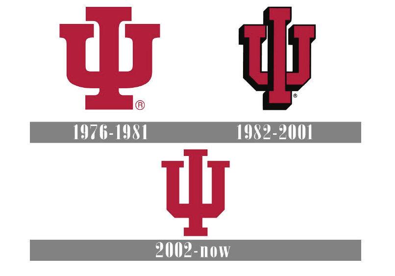
Just one look at the evolution of the IU logo over time demonstrates a CLEAR effort to hide the fact that it is an I and a U. The 1970s version has a curved U and a proportional I of normal height. The 80s and 90s version outlines the letter in black, making the truth obvious.
In 2002, everything changed. The letter I was stretched beyond recognition. The letter U was squared off and turned into an unrecognizable caricature of its former self. What happened that year?
More importantly, if the IU deep administration could hide this for so long from a whole generation of students, what else are they keeping from us? Use this knowledge as you will.
We’ll keep you updated as this earth-shattering news affects every aspect of everyone’s lives.